See what actually happened to SIP investors across every historical market cycle since 1995.
Introduction: The Problem With “Expected Returns”
Every mutual fund advertisement in India ends with a disclaimer: “past performance is not indicative of future results.” And yet, almost every SIP calculator you have ever used does the exact opposite — it asks you to enter an expected annual return of, say, 12%, and then projects your corpus as if that number were guaranteed, compounding neatly every single year until retirement.
The gap between what calculators show and what investors actually experience is the source of enormous financial anxiety in India. Investors who were told to expect ₹1 crore after 15 years sometimes end up with ₹60 lakhs. Others, luckier with their entry timing, end up with ₹1.4 crore. Both invested the same amount, at the same monthly figure, for the same duration. The only difference was when they started.
This is the problem that the Historical SIP Outcome Database is built to solve.
Instead of asking you to project forward with an assumed return, it shows you backwards — what did SIP investors in this category, at this tenure, actually end up with? What was the best outcome ever recorded? What was the worst? What do most people end up with? And what is the probability that you would have walked away with a positive return at all?
Quick Summary
The Historical SIP Outcome Database is a free backtesting tool that shows you — using three decades of real Indian market data — what best, median, and worst-case outcomes SIP investors actually experienced across different fund categories and tenures. Rather than showing you projected future returns, it reveals the full distribution of historical results: from the investor who started a Large Cap SIP in 2003 and rode the bull market to extraordinary returns, to the one who began in 2007 just before the global financial crisis. Understanding this range is not pessimism — it is the financial intelligence that separates confident investors from anxious ones.
What Is the Historical SIP Outcome Database?
The Historical SIP Outcome Database is an interactive, web-based tool that synthesises rolling SIP simulations from real Indian market data spanning approximately 1995 to 2026. It covers seven fund categories:
- Large Cap (Nifty 50 TRI)
- Mid Cap (Nifty Midcap 150 TRI)
- Small Cap (Nifty Smallcap 250 TRI)
- Hybrid / Balanced (60–70% equity)
- Thematic / Sectoral (PSU / Tech / Infra / Consumption themes)
- Flexi / Multi Cap (dynamic allocation)
- Debt / Conservative Hybrid (Liquid / Short Duration / Gilt)
For each category, it shows you outcomes across eight investment tenures — 3, 5, 7, 10, 12, 15, 20, and 25 years — with your SIP amount fully adjustable from ₹1,000 to ₹1,00,000 per month.
The data for each combination answers five questions:
- Best-case corpus — what the luckiest historical start date produced
- Best-case CAGR — the annualised return in that best scenario
- Median corpus — what the 50th percentile investor ended up with
- Median CAGR — the annualised return at the median
- Worst-case corpus — what the most unlucky historical start date produced
- Worst-case CAGR — the annualised return in that worst scenario
- Win rate — the percentage of all rolling start dates that produced a positive real return
Beyond the headline numbers, the tool also shows a CAGR distribution chart — a stacked bar that tells you what fraction of investors in each category ended up with returns below 5%, between 5–8%, 8–12%, 12–16%, 16–20%, and above 20%. This distribution is arguably the most important visualisation in the entire tool.
There is also a Compare Mode that puts all seven categories side-by-side for any given tenure — so you can see at a glance whether mid-cap’s higher median corpus justifies its dramatically worse worst-case outcome compared to large-cap.
How the Tool Works: The Methodology Behind the Numbers
Rolling SIP Simulations
The tool uses a rolling window methodology, which is the most intellectually honest way to analyse historical SIP performance. Here is what that means:
Imagine a 10-year SIP window. Instead of picking one arbitrary start date and measuring from there, the rolling approach tests every possible 10-year window within the historical data. If data exists from 1995 to 2026, that gives us roughly 17 distinct non-overlapping 10-year periods, or many more overlapping windows if monthly granularity is used. Each window represents a real investor who could have started their SIP on that date.
The “best” outcome is drawn from the top decile of all such windows — representing investors who had the best luck with their entry timing (say, beginning a SIP in March 2003, just before one of the greatest bull markets India has ever seen). The “worst” outcome comes from the bottom decile — representing investors who had the worst luck (say, starting a SIP in January 2008, six months before the global financial crisis cratered portfolios).
The median is the outcome of the investor who was neither lucky nor unlucky — the 50th percentile, representing what a typical, average-timing investor actually experienced.
Index-Based Data Sources
The underlying indices used are:
- Nifty 50 TRI (Total Return Index, which includes dividends) for Large Cap
- Nifty Midcap 150 TRI for Mid Cap
- Nifty Smallcap 250 TRI for Small Cap
- CRISIL Hybrid and Debt indices for Hybrid and Debt categories
The use of Total Return Indices is important — it means dividends are reinvested, making the data more realistic than price-only indices.
Important Caveats
The tool is transparent about its limitations:
- Actual fund returns differ from index returns due to expense ratios (0.5–2% annually), fund manager skill (positive or negative alpha), and tracking error.
- Outcomes shown are approximate; real investor results vary.
- This is a research and educational tool, not investment advice.
- Past performance does not guarantee future results.
That last point bears repeating — but the flip side is equally true: past performance does tell you something about the range of possible outcomes, which is far more useful than a single projected number.
Category-by-Category Analysis: What the Data Tells Us
Large Cap: The Dependable Foundation
Large Cap funds tracking the Nifty 50 are the bedrock of most Indian retail SIP portfolios, and the historical data justifies that trust — with important nuances.
For a ₹10,000 monthly SIP over 10 years (total invested: ₹12 lakhs):
- Best corpus: ₹30.5 lakhs at 21% CAGR
- Median corpus: ₹24.5 lakhs at 13% CAGR
- Worst corpus: ₹18.5 lakhs at 9% CAGR
- Win rate: 99% — almost every historical window produced a positive return
What is remarkable is the win rate — 99% of all 10-year rolling windows in Large Cap ended positively. This is the statistical foundation for the oft-repeated advice that “if you stay invested long enough, large-cap equity always rewards you.”
But equally striking is the spread between best and worst. The best investor made ₹12.05 lakhs more than what they put in. The worst made only ₹6.5 lakhs more — still profitable, but barely half as much. The difference in behaviour between these two investors was identical. They invested the same amount, at the same frequency, for the same duration. Market timing — not investment skill — drove the 65% difference in outcome.
At 15 years, the median corpus for ₹10,000/month is ₹50 lakhs against ₹18 lakhs invested — a 2.8x multiple. At 25 years, it grows to ₹1.95 crore against ₹30 lakhs invested — a 6.5x multiple. This is compounding at its most patient.
Mid Cap: The Performance Premium Has a Price
Mid Cap has delivered historical median CAGRs of 16–18% over long periods, meaningfully above large-cap. But the tool shows you exactly what you are paying for that premium.
For a ₹10,000 monthly SIP over 10 years:
- Best corpus: ₹44 lakhs at 24% CAGR
- Median corpus: ₹31 lakhs at 16% CAGR
- Worst corpus: ₹20 lakhs at 9% CAGR
- Win rate: 97%
The median outcome is 27% better than Large Cap’s ₹24.5 lakhs. But the worst-case is ₹1.5 lakhs worse than Large Cap’s worst. And the best-case is ₹13.5 lakhs better — showing you the full upside of taking mid-cap risk when timing cooperates.
At 3 years — the short-tenure danger zone — the worst mid-cap CAGR was -12%. An investor who put in ₹3.6 lakhs over 3 years and got back ₹2.6 lakhs has not just failed to generate returns — they have lost real money.
This is not to discourage mid-cap investing. It is to quantify the psychological preparation required. If you cannot stomach watching your ₹3.6 lakh SIP become ₹2.6 lakhs at year three before recovering to ₹31 lakhs by year ten, mid-cap is not for you — regardless of its higher median return.
Small Cap: The Highest Highs, the Lowest Lows
The Small Cap data is simultaneously thrilling and sobering.
For ₹10,000/month over 25 years:
- Best corpus: ₹5 crore (₹500 lakhs) — 1,567% of the ₹30 lakh invested
- Median corpus: ₹3.2 crore
- Worst corpus: ₹1.75 crore
These are extraordinary numbers. But zoom out to 3 years:
- Best corpus: ₹9 lakhs at 52% CAGR
- Worst corpus: ₹2 lakhs at -22% CAGR
- Win rate: only 64%
That 64% win rate at 3 years deserves to be read twice. More than one in three investors who ran small-cap SIPs for 3 years lost money. This is not a theoretical risk — it happened repeatedly across real market cycles.
The distribution chart for small cap is particularly revealing. At 5 years, 16% of investors got returns below 5% annually and another 10% got below 8%. That means roughly one in four small-cap SIP investors at 5 years barely beat a savings account. The counterpoint: 16% got above 20% CAGR — transformational wealth creation.
The lesson from small-cap data is unambiguous: this category rewards patience with enormous generosity but punishes short tenures brutally. The appropriate use of small-cap SIPs is a 10+ year commitment, ideally 15–20 years, where the distribution shifts dramatically in your favour.
Hybrid / Balanced: The Underrated Compounder
Hybrid funds (60–70% equity, rest in debt and other assets) do not generate the excitement of small-cap returns. But the risk-adjusted profile they reveal in historical data is genuinely impressive.
For ₹10,000/month over 10 years:
- Best corpus: ₹26.5 lakhs
- Median corpus: ₹21.5 lakhs
- Worst corpus: ₹17.5 lakhs
- Win rate: 100%
The gap between best and worst is only ₹9 lakhs — the smallest range of any equity category at this tenure. That predictability has real psychological value. Investors who know that “even in the worst case I will end up with ₹17.5 lakhs” are far less likely to panic-redeem during a market crash — which is itself one of the biggest destroyers of investor returns in India.
The debt allocation within hybrid funds acts as a natural buffer during equity downturns, reducing drawdowns and smoothing the ride. The CAGR distribution shows that 98%+ of hybrid investors at 7 years or longer end up in the 8–16% CAGR band — narrow but comfortably above inflation.
For conservative investors, first-generation investors, or those entering the market for the first time, the hybrid category’s historical data makes a compelling case that it is not a compromise — it is a rational choice.
Thematic / Sectoral: The Category That Demands Expertise
Thematic funds — covering PSU, Technology, Infrastructure, Consumption, and other theme-based mandates — show the most extreme distribution of any category in the database. The long-term CAGR range is listed as 6–22%, and the data supports that extraordinary spread.
For ₹10,000/month over 3 years:
- Best corpus: ₹12 lakhs at 62% CAGR
- Worst corpus: ₹1.8 lakhs at -30% CAGR
- Win rate: only 60%
No other category comes close to this magnitude of variance. An investor who caught the right thematic cycle made 3.3x their invested money in three years. An investor on the wrong side of a cycle lost nearly half their investment.
At 10 years, 32% of thematic SIP investors still saw below-12% CAGR returns — in a category that sometimes promises the moon. The 10-year win rate of 88% means 12 out of every 100 investors who stayed the course for a decade still ended with a negative real return after inflation.
Thematic investing via SIP can be rewarding — but only for investors who genuinely understand the cycle they are investing in, can time entry and exit of themes, and have the risk tolerance to accept that even a 10-year commitment may not save them. This is not a category for default allocation.
Flexi / Multi Cap: The Category That Adapts
Flexi-cap and multi-cap funds have a flexible mandate to allocate across large, mid, and small-cap segments based on market conditions and fund manager judgment. The historical data shows a profile that sits sensibly between large-cap stability and mid-cap aggression.
For ₹10,000/month over 15 years:
- Best corpus: ₹82 lakhs
- Median corpus: ₹58 lakhs
- Worst corpus: ₹40 lakhs
- Win rate: 100%
The median corpus is 16% higher than large-cap’s ₹50 lakhs at the same tenure, with a worst-case that is 8% better (₹40L vs ₹37L). The combination makes a strong case for flexi-cap as a single-fund, all-weather equity allocation, particularly for investors who want mid-cap exposure without the commitment to pure mid-cap volatility.
Debt / Conservative Hybrid: Capital Preservation, Honestly Presented
The debt category data is perhaps the most honest section of the tool. It shows exactly what debt investing delivers — and exactly what it cannot.
For ₹10,000/month over 15 years:
- Best corpus: ₹31 lakhs
- Median corpus: ₹28.5 lakhs
- Worst corpus: ₹26.5 lakhs
The win rate is 100% at every tenure. The range is extremely tight. And the CAGR distribution shows 70–75% of investors clustering in the 8–12% CAGR band.
What debt funds do not do is build wealth at the pace equity does. ₹28.5 lakhs against ₹18 lakhs invested over 15 years is a 1.6x multiple. Large-cap’s ₹50 lakhs is a 2.8x multiple over the same period. The gap — ₹21.5 lakhs over 15 years — represents the cost of capital preservation.
This framing is not to dismiss debt funds but to correctly position them. For a goal that must be met (a child’s education fee, a home down payment in two years), the predictability of debt outcomes justifies sacrificing the equity upside.
The CAGR Distribution: The Most Important Visual in the Tool
Most investors focus on the best/median/worst corpus numbers. But the CAGR distribution chart is, arguably, more useful for decision-making.
The distribution shows you, for each tenure, what percentage of SIP investors ended up in each return band — below 5%, 5–8%, 8–12%, 12–16%, 16–20%, and above 20%. This answers a question that no single number can: “What is the realistic range of my outcome?”
Consider the contrast between Large Cap and Small Cap at 5 years:
Large Cap at 5 years:
- Below 8%: 22% of investors
- 8–16%: 46% of investors
- Above 16%: 18% of investors
Small Cap at 5 years:
- Below 8%: 30% of investors
- 8–16%: 31% of investors
- Above 16%: 26% of investors
Small cap at 5 years has a higher chance of giving you an extraordinary outcome (26% vs 18% above 16% CAGR) — but also a meaningfully higher chance of disappointing you (30% vs 22% below 8%). For the same tenure, you are taking a wider bet with small cap. The distribution makes that trade-off explicit.
Now compare the same at 15 years:
Large Cap at 15 years:
- Below 12%: ~19% of investors
- 12–20%: ~70% of investors
- Above 20%: ~11% of investors
Small Cap at 15 years:
- Below 12%: ~13% of investors
- 12–20%: ~44% of investors
- Above 20%: ~42% of investors
At 15 years, small cap dramatically shifts the distribution toward the high end. The risk of underperformance shrinks, and the probability of an above-20% CAGR result rises from 11% to 42%. Time does what nothing else can — it resolves short-term variance into long-term probability.
How to Use the Tool: A Step-by-Step Guide
Using the Historical SIP Outcome Database is simple but there are some non-obvious features worth highlighting.
Step-by-step guide for using Historical SIP Outcome Database
Set Your SIP Amount
The slider adjusts from ₹1,000 to ₹1,00,000 per month. All corpus figures scale proportionally. If you are considering a ₹25,000/month SIP, set it there — the numbers become immediately actionable rather than abstract multiples you calculate in your head.
Choose Your Category
Click any of the seven category cards on the left to make it active. Notice that each card shows you the current tenure’s median corpus, median CAGR, and win rate — giving you a quick comparison before you dive into the full table.
Use the Tenure Filter
The “All Tenures” view shows you the full table across all eight time horizons in one glance. Alternatively, filter to a specific tenure that matches your investment horizon. If you are 35 and plan to retire at 55, 20 years is your relevant filter. Looking at 3-year data when you have a 20-year horizon is intellectually interesting but not decision-relevant.
Switch Between Tabs
The tool has three main views:
Outcome Table — the primary data table with best, median, and worst figures
CAGR Distribution — the stacked bar chart showing return band probabilities
Compare Mode — all categories side-by-side for head-to-head comparison
For research purposes, the CAGR distribution tab is the one to spend the most time in. For quick decision-making, Compare Mode is invaluable.
Read the Insight Box
Below the main data for each category, the tool surfaces a contextualised insight — for example: “A ₹25,000 monthly SIP in Small Cap funds for 15 years would have historically produced: Median corpus ₹1.88 Cr, Worst observed outcome ₹1.00 Cr, Best observed outcome ₹2.88 Cr.” This plain-language translation of the data is particularly useful for investors who prefer natural language to table-scanning.
Decision Framework: What This Data Should Actually Tell You
The tool is powerful precisely because it does not give you a single answer. It gives you a range. Here is how to use that range productively.
For Goal-Based Planning
If you have a specific target — say ₹50 lakhs in 10 years for your child’s college education — do not plan around the best case. Plan around the median. Then check: can I survive the worst case? If the worst case still meets your minimum requirement (say, ₹35 lakhs), the category is appropriate. If the worst case falls below your minimum (only ₹18 lakhs when you need ₹40 lakhs), you need either a different category, a higher SIP amount, or a longer tenure.
This is genuine risk management — not theoretical, but grounded in the actual range of outcomes you might face.
For Psychological Preparation
One of the most underappreciated uses of this tool is psychological. Many investors stop SIPs at the worst possible time — during market downturns — because they were never prepared for the possibility of a temporary loss. When you have seen that “the worst-case 5-year small-cap outcome was -5% CAGR and it still recovered beautifully by year 10,” a 15% portfolio decline in year 3 feels very different. You expected it. You prepared for it. You do not panic.
The tool should be read before starting a SIP, not after things go wrong.
For Category Allocation Decisions
If you are trying to decide how to split ₹30,000/month across categories, use Compare Mode at your target tenure. Notice which categories have acceptable worst-case outcomes for your situation, then build your allocation around that floor — rather than chasing the highest median.
A reasonable allocation for a 30-year-old with a 20-year horizon might be:
- 40% Large Cap or Flexi Cap (reliable foundation)
- 30% Mid Cap (performance premium with acceptable volatility)
- 20% Small Cap (high-upside long-term compounder)
- 10% Hybrid (ballast and rebalancing asset)
The tool allows you to model each leg of this allocation independently — understanding what each piece contributes and what its downside looks like.
Common Mistakes This Tool Helps You Avoid
Mistake 1: Planning Around Best-Case Returns
The most dangerous thing a SIP investor can do is plan their retirement corpus using the best historical outcome. If a 15-year large-cap SIP at ₹10,000/month “can” produce ₹65 lakhs, planning a retirement that requires exactly ₹65 lakhs means any underperformance leaves you short. The median outcome of ₹50 lakhs is a more prudent planning number — and even then, you should have a backup if you end up in the below-median cohort.
Mistake 2: Choosing Short Tenures for High-Volatility Categories
Small-cap and thematic SIPs at 3–5 year tenures have win rates of 60–78%. That means roughly one in four (or one in three) investors walked away with less than they put in. Many investors make this mistake not because they intended a short tenure but because they redeemed early — during a bad patch — instead of staying the course. Knowing in advance that your category has a 36% loss rate at 3 years might be the nudge you need to commit to a longer horizon before you start, rather than discovering it painfully mid-journey.
Mistake 3: Ignoring the Cost of Consistency
The rolling SIP methodology in this tool assumes monthly investments were made consistently, through every crash, every correction, every period when “the market looks bad.” In practice, many investors pause SIPs during downturns — precisely the moments when continued investment buys the cheapest units and lays the foundation for recovery gains. The best historical outcomes were often driven as much by uninterrupted consistency as by market timing. The worst outcomes for long tenures often reflect not the market but investor behaviour.
Mistake 4: Comparing Categories Only on Median Returns
When deciding between mid-cap and large-cap, most investors compare 16% versus 13% median CAGR and conclude mid-cap is better. But the appropriate comparison includes the worst-case differential (₹20L vs ₹18.5L at 10 years), the CAGR distribution spread, and critically, the win rate evolution across tenures. The Compare Mode exists precisely to force this multi-dimensional comparison.
Connecting the Dots: How This Tool Fits Into the Wealthpedia Ecosystem
The Historical SIP Outcome Database is one tool in a broader suite at Wealthpedia.in, a Personal Finance Operating System built specifically for Indian investors. Understanding how these tools work together makes the data from the database significantly more actionable.
Financial Health Score
Before making any new SIP decision, your Financial Health Score gives you a 15-question diagnostic of your current financial position — covering savings rate, emergency fund, debt load, insurance coverage, and investment diversification. If your health score flags that your emergency fund is inadequate, the answer is not to add more SIPs in small-cap; it is to build the buffer first. The SIP outcome database helps you plan optimally only when your baseline financial health is sound.
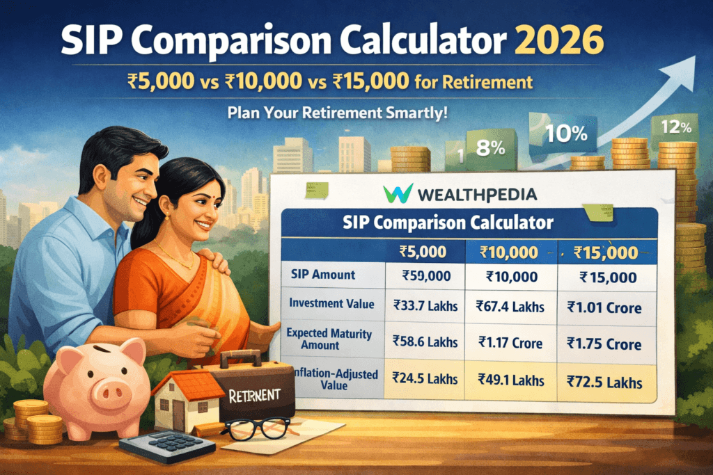
SIP Comparison Calculator
The SIP Comparison Calculator on Wealthpedia takes the historical data one step further — it lets you compare how specific fund options (not just categories) would have performed under different scenarios, with detailed year-by-year projections. Use the Outcome Database to understand the category-level risk/return profile, then use the Comparison Calculator to evaluate specific fund choices within that category.
EMI Pro Calculator
If you are running both SIPs and EMIs — which describes the majority of Indian households with home loans or car loans — the EMI Pro Calculator is essential context. The opportunity cost of EMI payments versus investing the same amount in SIPs is one of the most common dilemmas in Indian personal finance. The historical outcome data helps quantify that trade-off: “If I prepay ₹2 lakh on my home loan versus invest it as a lump sum in large-cap, what does history suggest about the relative outcome?” The tools together answer that.
Multi-Goal FIRE Planner
The Multi-Goal FIRE Planner is perhaps the most natural companion to the SIP Outcome Database. Once you have studied the historical outcome ranges for each category, you can plug the median (or conservative) CAGR assumptions into your FIRE plan with eyes open — knowing that your retirement corpus projection is grounded in what the market has actually delivered, not a single optimistic assumption. The planner allows you to model multiple financial goals simultaneously (retirement, child’s education, home purchase) and shows you whether your current SIP trajectory, calibrated with realistic return assumptions from historical data, reaches your goals.
The power of the Wealthpedia ecosystem is this shared financial context: when you update your SIP amount in the Health Score profile, it carries through to your FIRE plan and comparisons — you never re-enter data you have already provided. This is the OS model — data entered once, used everywhere.
Advanced Insights: What the Data Tells Us About Indian Market Cycles
The database effectively captures six major phases of the Indian equity market since 1995:
1. The Pre-Liberalisation Recovery (1995–2003): A largely choppy, sideways market that was forgiving to patient investors but punishing to anyone who expected continuous gains. SIPs started in this era bought extremely cheap units through flat markets, setting up for extraordinary gains in the next phase.
2. The Great Bull Run (2003–2007): Perhaps the best four-year SIP start window in Indian market history. Investors who began SIPs in 2003 were buying at rock-bottom prices and riding a market that quintupled. Many of the “best case” outcomes in the database trace back to this entry window.
3. The Global Financial Crisis (2008–2009): A brutal interruption that halved portfolios in months. SIPs started in 2007 saw their invested corpus fall dramatically in year one. But investors who did not stop saw recoveries that eventually matched and exceeded the pre-crisis peak. This is why win rates at 5+ years remain so high even accounting for 2008 — the market recovered and rewarded those who stayed.
4. The Sideways Decade (2010–2013): Mid-cap and small-cap stagnated even as large-cap made modest recoveries. This period explains some of the worst-case outcomes visible in the 5–7 year tenure windows for mid and small-cap.
5. The Modi Market (2014–2017): The BJP election victory triggered a sustained rally, particularly in PSU, infrastructure, and defence themes. Thematic funds saw explosive returns during this phase — which is visible in the thematic category’s best-case figures.
6. The Consolidation and Recovery (2018–2026): A COVID shock in 2020, followed by one of the fastest market recoveries in history, followed by strong small and mid-cap performance through 2023–24. The recent vintages of SIP investors have generally done well, though valuations entering 2025–26 are elevated relative to history.
The tool does not make future market predictions. But understanding which historical phases created the best and worst outcomes gives you context for reading the numbers — and for stress-testing your own expectations.
Frequently Asked Questions
Are these numbers guaranteed?
No. These are historical simulation outcomes based on index data, not any guarantee of future performance. Actual mutual fund returns differ from index returns due to expense ratios, fund manager decisions, and other factors.
Why does the tool show index-level returns? What about actual funds?
Index-based data provides a clean, standardised baseline free from survivorship bias (the tendency to remember only funds that survived and did well). Actual fund returns for large-cap will typically be 0.5–1% lower than Nifty 50 TRI due to expense ratios; for actively managed mid/small-cap, returns may be higher or lower depending on fund manager skill.
Should I use the best, median, or worst case for my planning?
Plan with the median for your base case. Stress-test with the worst case. Dream with the best case — but never plan your financial life around it.
The tool shows a small-cap 25-year SIP could produce ₹5 crore. Is that realistic?
It is historically observed, not fabricated. But it requires 25 years of uninterrupted SIP, reinvested dividends via TRI, and the timing luck of a good entry vintage. The median outcome of ₹3.2 crore is more prudent to plan with.
How often is the data updated?
The database is periodically refreshed as new market data becomes available. The current dataset covers approximately 1995–2026.
Conclusion: From Data to Confidence
The greatest gift that historical data can give a SIP investor is not the promise of returns. It is the preparation for reality.
Every investor who panics during a market crash and redeems their SIP was doing so with an image in their mind of what their investment “should” look like — an image formed by a single projected return, a smooth compounding curve, an expectation never stress-tested against what the market actually does.
The Historical SIP Outcome Database replaces that fragile single-number fantasy with a robust, empirically grounded range. You will not always get the median. You might get the worst case. You might get the best. What you will definitely get — if you stay invested, if you keep your SIPs running through corrections, if you chose a tenure appropriate for your category — is the benefit of thirty years of data that consistently shows long-term equity SIPs in India create wealth.
The difference between a ₹1 crore and a ₹3 crore outcome for a small-cap investor is mostly time, consistency, and the psychological resilience to not sell when the news is bad. This tool gives you the data. What you do with it — how it changes your habits, your horizon, your resolve — is entirely in your hands.
Use the Historical SIP Outcome Database alongside the Multi-Goal FIRE Planner, the SIP Comparison Calculator, and the Financial Health Score to build a complete picture of your financial trajectory. Not an optimistic one. Not a pessimistic one. A realistic one — grounded in what Indian markets have actually delivered to actual investors across thirty years of bull runs, crashes, recoveries, and everything in between.
That realism is not a limitation. It is the foundation of financial confidence.
Data source: Rolling SIP simulations using Nifty 50 TRI, Nifty Midcap 150 TRI, Nifty Smallcap 250 TRI, and CRISIL Hybrid/Debt indices (1995–2026). This article is for educational purposes only and does not constitute investment advice. Consult a SEBI-registered investment adviser before making investment decisions.
Vishal Jhaveri is the founder of Wealthpedia and an MBA Finance professional with over 10 years of experience in financial planning, investing, and wealth creation. He specializes in FIRE (Financial Independence, Retire Early), retirement planning, investing, and personal finance education. Through Wealthpedia, he develops financial calculators and publishes evidence-based content to help Indian investors make informed financial decisions. He regularly reviews and updates Wealthpedia articles to reflect changes in tax, laws, investment regulations, and personal finance best practices.
Quick Wrap up